Was recently asked to help come up with data to help give the library a better handle on who is using our e-resources–to complement the numbers we have on what’s being used. Hard to be precise given all the variables, but I did hit upon something I think serves as a reasonable proxy (no pun intended).
Step one was to pull together three different datasets:
- an enormous (70+ million lines) proxy server log that covered all off-campus activity for restricted resources for the entire Fall 2015 semester. This log has NetIDs for users.
- our campus directory e-file which includes both a NetID (email address) and the major or departmental affiliation for students, faculty and staff
- a spreadsheet from a friend in Admissions which gave meaningful descriptions to the many four letter codes for majors we use here at Mason
The proxy server logs and campus directory were imported into MySQL tables (using the methodology I outlined a couple of years ago in a post about parsing EZProxy logs). I then ran a simple SQL query:
select affiliation,count(*) from users
join proxy where proxy.username = users.username
group by users.affiliation
order by count(*),desc
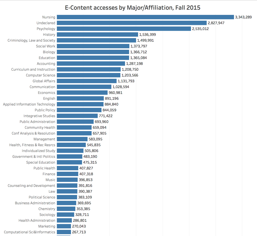
Ended up with a result like this:
| NURS | 3343289 |
| UNDE | 2827947 |
| PSYC | 2535012 |
| HIST | 1536399 |
| CLS | 1499991 |
| SOCW | 1373797 |
| BIOL | 1366712 |
| EDUC | 1365084 |
| ACCT | 1287198 |
| CRIN | 1208750 |
| CS | 1203566 |
| GLOA | 1131793 |
| COM | 1028594 |
| ECON | 960981 |
| ENGL | 891196 |
| AIT | 884840 |
| PUBP | 844059 |
…and so on.
Exported the MySQL results to a CSV file and launched Tableau. Within Tableau, I joined the results of my MySQL work with the CSV file containing “major codes” and their descriptions (so I could flesh out those NURS, GLOA, PUBP codes). I hit one of Tableau’s “visualization” buttons.
Got a chart like the excerpt you see below. Eventually, the complete visualization became an appendix in a document we prepared for internal reporting. If you’re curious, you can download that final chart as a PDF.